Classical Chronicle
Winter 2019 - Present
Made With: HTML/CSS/JS
I helped start a newspaper at my high school called the Classical Chronicle and designed our branding and created a website from scratch. Since then, I’ve added new features, handled the upload of articles, and maintained the website. I’ve also collaborated on a couple of articles and created a few projects which live on the Chronicle website like the Food Sites Map and Classical Schedule App. Most recently, since I graduated, I also worked on the handoff to the new students in charge of the newspaper. This involved training them on the different components of the site, which into more detail about below.
Handoff
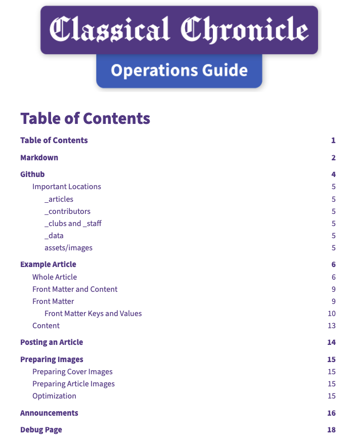
Screenshot of the title page of the Classical Chronicle Operations Guide.
Over the summer, I created an Operations Guide for how to run the website without me. I still host the website for them, but they have full control through the Github repository, which autodeploys onto the server on push.
Creating the guide involved going into detail about the many different moving parts of the website, while also keeping it simple enough to follow easily. I included information on how to use Markdown and Github as well as step-by-step instructions for posting an article, displaying announcements, and debugging common issues.
Hopefully the guide handles most of the questions they have, but they can also reach out to ask me if they get truly stuck.
The Redesign
 for more what it looked like before the redesign.](/assets/project-images/classical-chronicle-new.png)
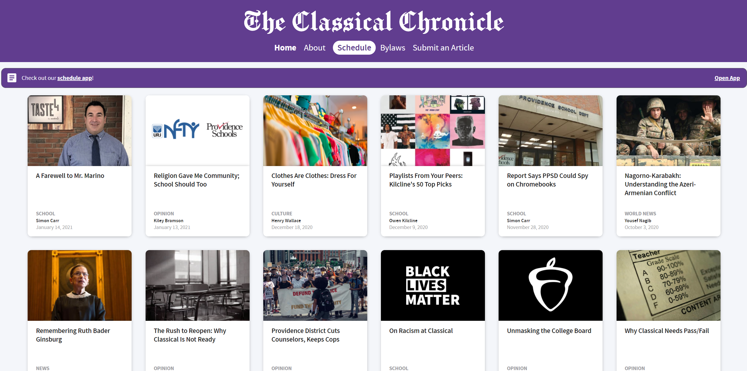
Screenshot of the Classical Chronicle homepage after the redesign. See below for more what it looked like before the redesign.
Above, you can see the current look of the Chronicle website after a major redesign. You can also see the previous design further down on this page. This redesign came about for a few reasons, but the biggest was definitely that we had gathered quite a few articles. The previous design just listed every article we had on one page, which worked quite well when we were just starting out.
As we grew however, we found that we really needed categories and only a subset of our articles visible on the page at a time. As part of this redesign, we wanted to organize the articles into specific categories (we started out with “School”, “Culture”, and “Opinion”, and later added “Sports”). Organizing the articles that way in a set order would have lost us the convenience of having more recent articles appear first, so I came up with a few solutions.
The most obvious one is the latest article card. This features the latest article front-and-center to showcase the work of the student who made it for as long as it is the latest article. The other optimization I made is making it so that the categories re-order themselves based on the most recent articles from each. That way, if nothing is posted in a category for a little while, that category moves to the bottom while categories with newer articles move up to the top.
Pre-Redesign
This is what the site looked like before the redesign.
This was the original design of the website before any major modifications. Since the beginning of the site, I made sure to include mobile support. Not only is it generally nice to have, but also probably the most common device to visit the website for students, which is our primary audience.
Tech-wise, the site is a static-site built using Jekyll. The files are ultimately hosted using NGINX on a webserver. All the articles are written in markdown and automatically displayed various places on the site using Liquid, which is the templating language that Jekyll uses. I wrote all the HTML and SCSS styles by hand according to an initial design I made and proposed to my collaborators.
For the most part, the underlying tech has remained unchanged since the beginning, but I have since then added auto-deploy functionality based on pushes to the repository. That way, when you commit to the main branch, the site is automatically regenerated and made live, which makes publishing changes easy.